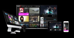
ShopTV Connected TV App
Centered around your favorite shows, sports & commercials: The ShopTV app enhances your TV experience by extending the best of the webs content, engagement, e-commerce & digital advertising features to your connected CE device.
My Roles:
Strategy & Research, Design: (UX, UI, Visual, & Motion), & Front End Development (CSS3 & HTML5)
Platforms:
Samsung, Sony & LG TVs
Technology:
HTML 5, CSS3, Javascript & Jquery, JSON, API, ACR
Proof of Concept
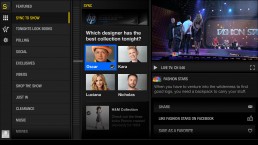
My first design concept for for the app contained a machine driven & user navigable timeline that was in sync to the content in the video. The samsung ACR technology recognizes video fingerprints we created for specific scenes on TV Shows and commercials that would trigger movement though the content in the timeline. This minimal approach was meant to leave the video forefront and the app operating in the least amount of space required for each scene/function.
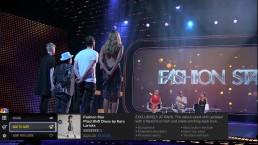
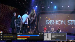

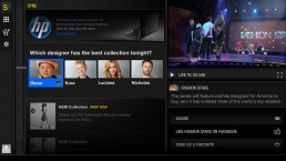
V2 3/4 Screen
The 2nd design attempt adapted the same content and experience as the 1rst take except it squeezed the video back to the corner of the app allowing more room for the content to breath and engage the user. It also explored deeper into the UI of the menu navigation and timeline elements of the app.
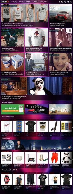
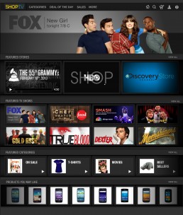
V3 Fullscreen Commerce
The app needed a fullscreen (no live video) design for when it is accessed from the Samsung Smart Hub and not triggered via video detection. This allowed a focused shopping experience on your TV with no video.
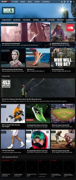
V4 3/4 Commerce
After creating diving into the fullscreen commerce experience I began to take the 3/4 screen shopping experience into account. My favorite part was keeping in mind responsive design techniques to make sure all the flow, functionality and features where consistent to the fullscreen version.
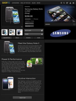
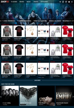
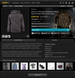
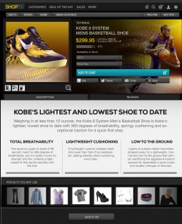
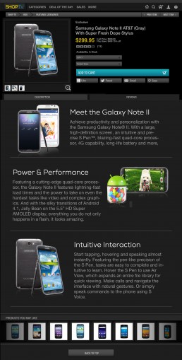
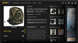
Product Detail Page
The following are exploratory designs around the product details pages. The idea was to provide more information and exploration around the products.

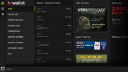
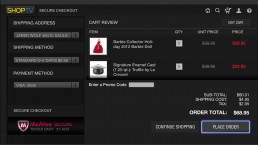
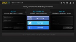
Log In & Checkout
Next up, I worked on a few different flows for account sign in, sign up, and checkout.
3.0 Chromeless
6 months of usage, data, & building campaigns for clients led to the enhancemnets in 3.0. We built a more flexible grid system breaking down the realiance on horizontal carousels. We also made a content strategy to use more lifestyle imagery and represent the different brands with type in a uniform way instead of using box art and logos.